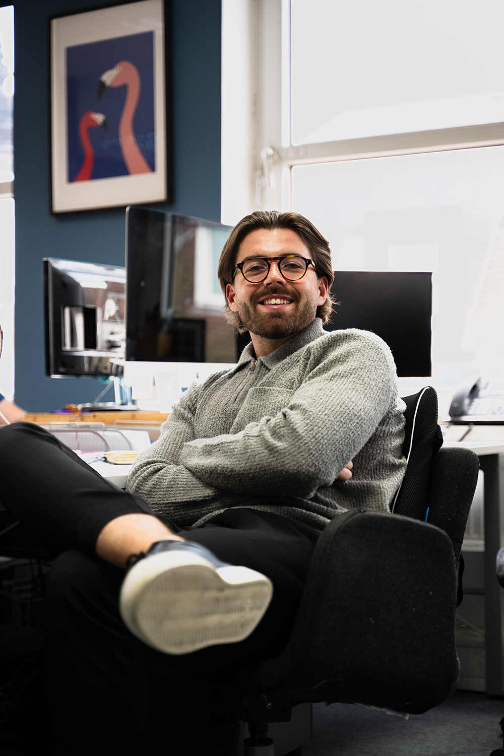
In 2016, We Are Fred began with just two mates, ten beers, and one amazing idea.
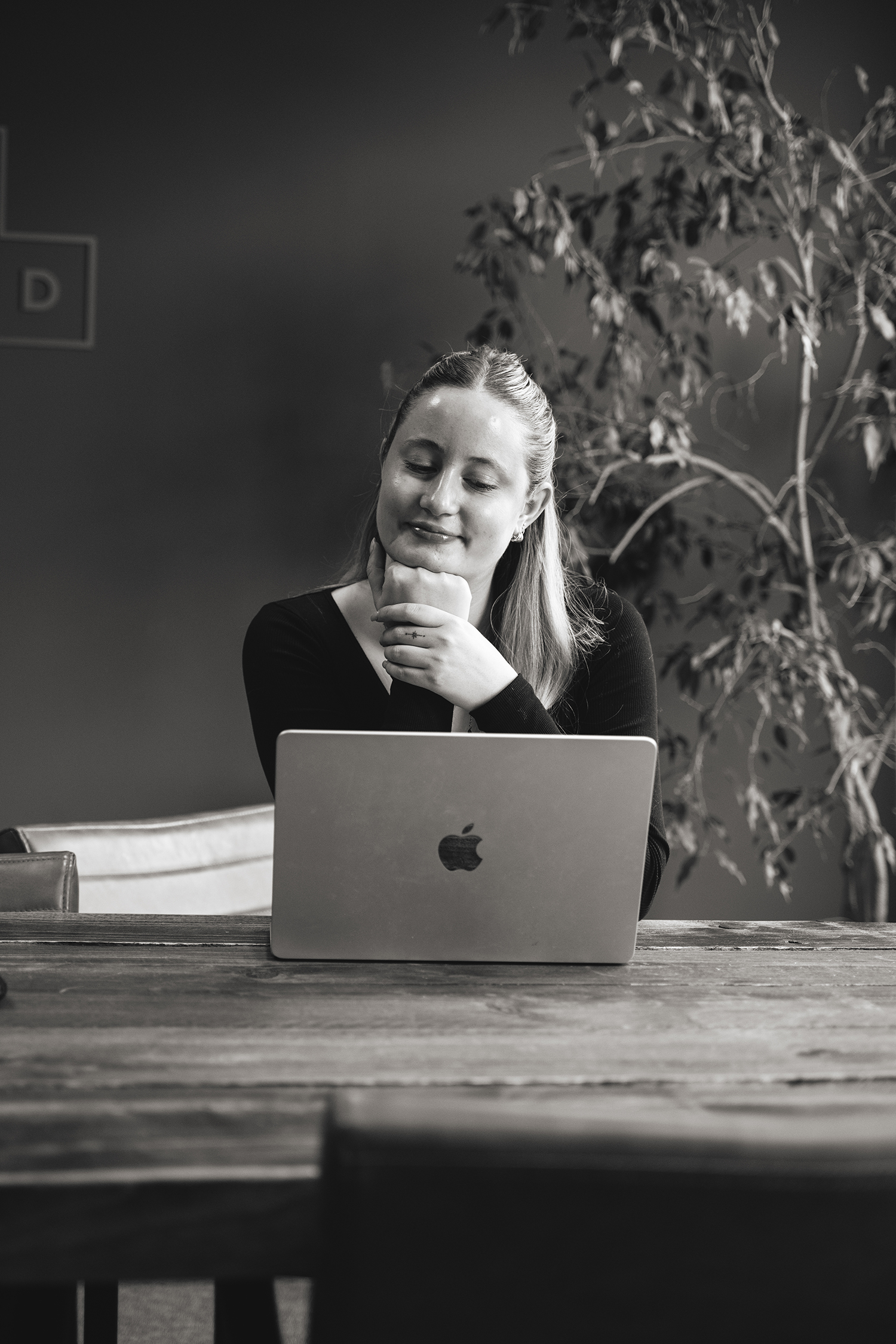
Now approaching our eighth year as a creative branding agency, we've come so far from where we've started; we moved to a bigger and better office (and opened another in Norwich!), our team has grown in talent and diversity, our competitor landscape has changed, and we even took home a Highly Commended Award from the PMAs just last year
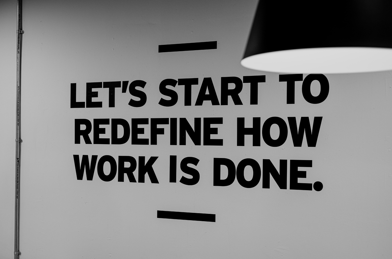
We'd been so focused on cultivating our reputation, now it's time for our brand and website to evolve along with us.
This is our next iteration of the Fred journey.
Typefaces
While we will always have a soft spot for Space Grotesk, we wanted something new, fresh, and a little more mature to represent our growth.
We settled on the pairing of sans serif Area and serif Antonia for a seamless blend of professionalism, personality, and character.

Brandmark
Now serving as an integral part of our brand equity and brand recognition, our logo remains steadfastly unchanged.
We have, however, developed a supporting version. Stripped down to its core shape, this icon can be used in place of the primary logotype when needed.
This secondary version will elevate the impact our brand has on current and future clients, and push the boundaries of our brand recognition even further.
Colour palette
Our desire to let our work do all the talking hasn't budged. And with our increasing client pool, this need has all but increased.
Which is why we said goodbye to our black-blue, aqua, and blue-grey trio and warmly welcome the classic black and white combo as our primary colour palette. This will allow us to station our work at the forefront without any other distractions.
For the digital space, we picked three bright and lively secondary colours to play around with: Original Orange, Aqua, and Lilac.

These are accent colours that can be brought in without disrupting our minimal black and white brand.
Personality
As a creative branding agency, our core offering is communication, whether it is communicating our message or our clients' through branding, animation, graphics, or tone of voice.
We're professional but we also like to be fun and approachable, and we know how to balance both sides. We get straight to the point with our clients without the need for unnecessary big words. We're human, insightful, and imaginative.
Check out our refined positioning across our new...
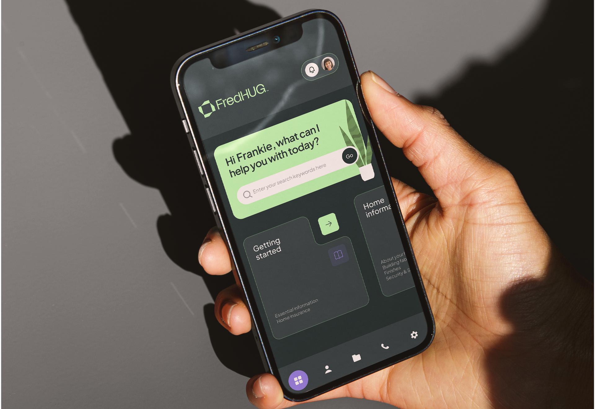
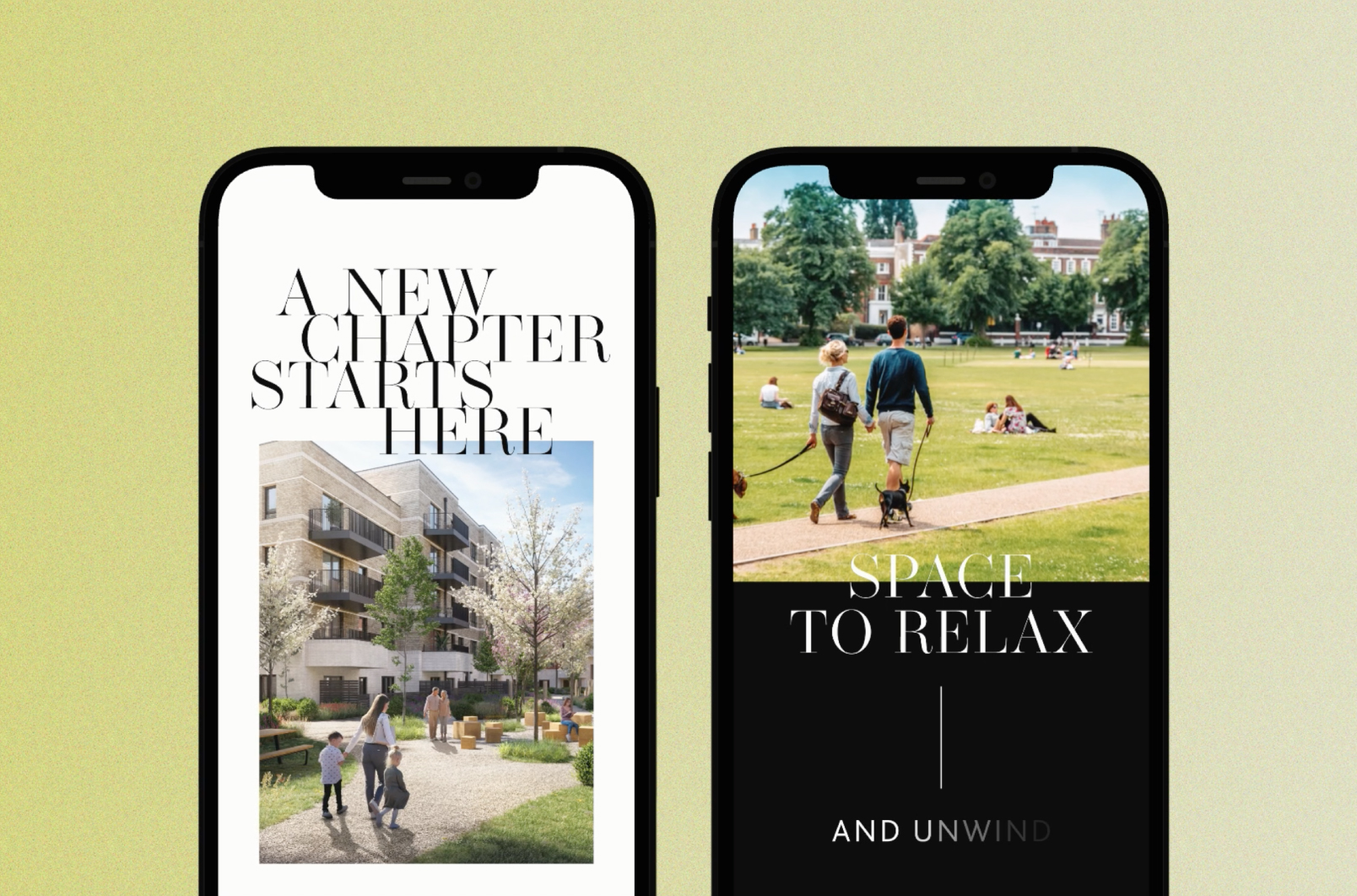
Website
We knew our website needed some heavy lifting, both in its appearance and user experience. To see exactly what we could improve on, we used Google Analytics to track statistics and Hotjar to track user journeys.
We're constantly challenging creativity and pushing boundaries; this time we decided to migrate to Webflow, a no-code website builder. This was new software we learnt from scratch, and now something we can add to our portfolio for our clients.
We've now streamlined navigation with tags and disciplines, adjusted the background so our content is more legible, and optimised the overall layout. More importantly, our work and case studies take the spotlight with large header images and animations.
Our final thoughts
This is neither the beginning nor the end of our identity journey.
But with our new brand elements and website, we're at our best. And we're excited to be doing more for a world of brands in constant motion.


.jpg)


