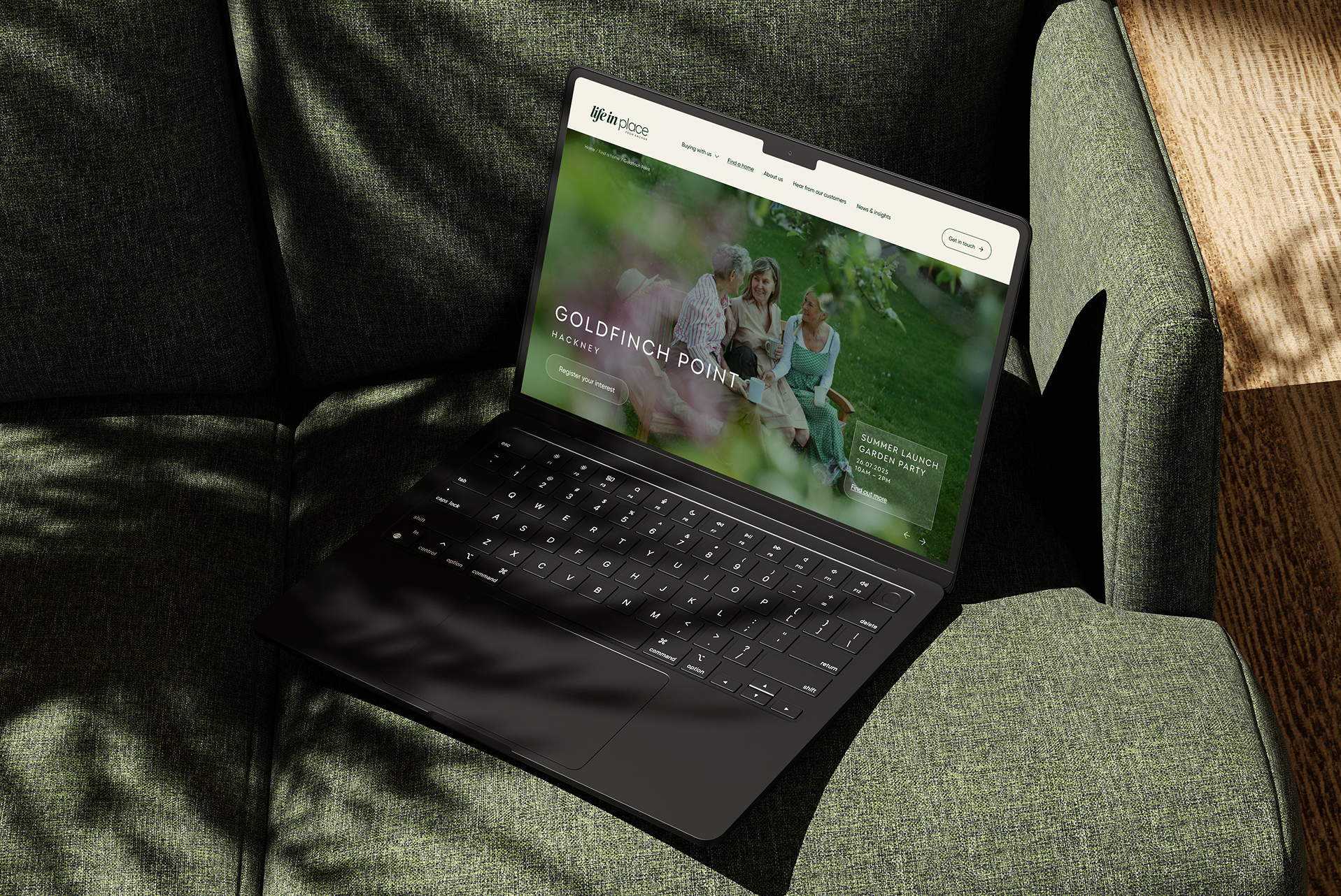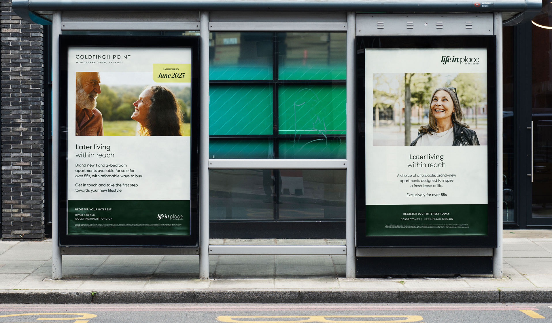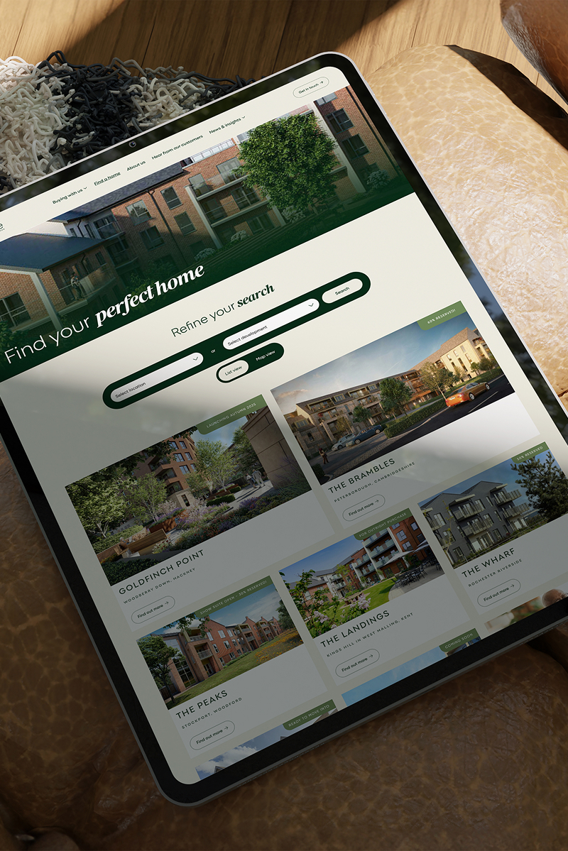

With new developments and offerings in private sale and Shared Ownership on the horizon, a cohesive brand identity was needed for Anchor New Homes that reflects Anchor's values, achieves market standout, and resonates with their target audience. Welcome to Life in Place.
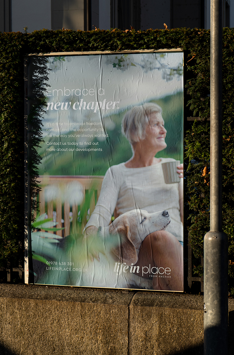
It's engaging, human and authentic. Our chosen typefaces, a serif and sans-serif combination, and logo inject life anew into the brand while connecting back to Anchor. And our colour suite conveys the very warmth, quality and care you can expect.
Across the collateral we’ve produced – digital, print, video, signage and more – a clear and compelling story emerges: Life in Place is where you can look with confidence to the years ahead.
Brand identity & strategy, market positioning, animated brand suite, proposition & values, tone of voice, aesthetic standard, website


